Print Design / Typography / Brand Design
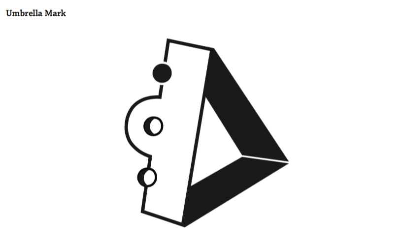
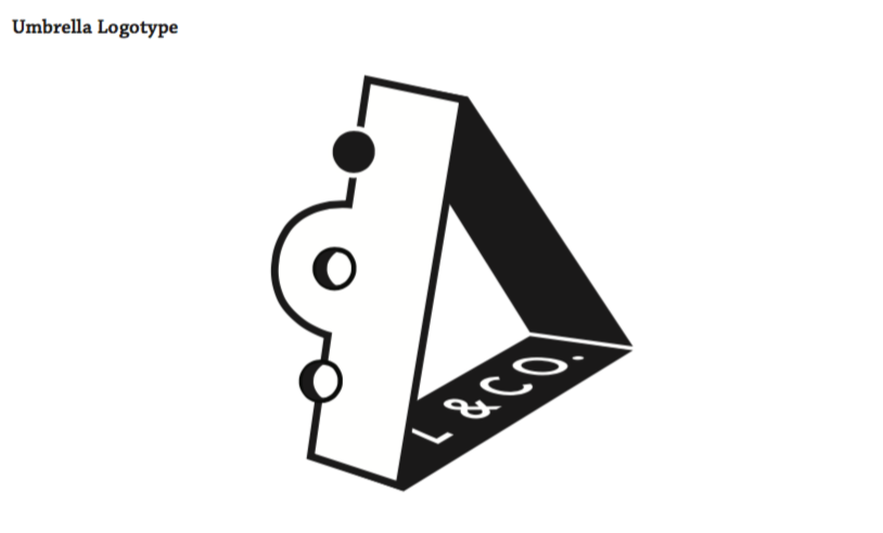
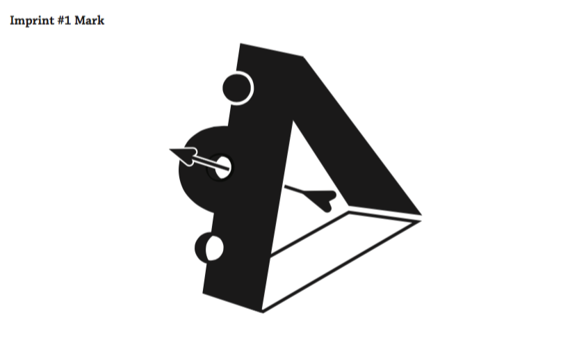
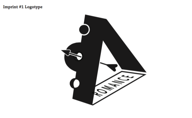

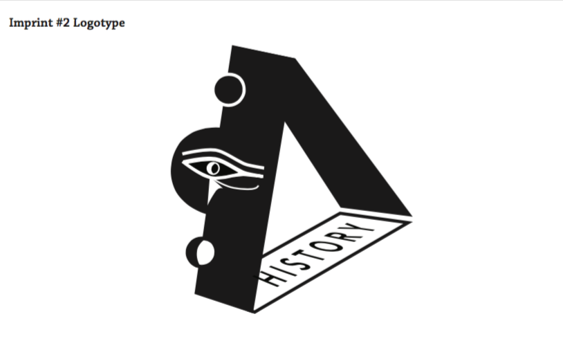


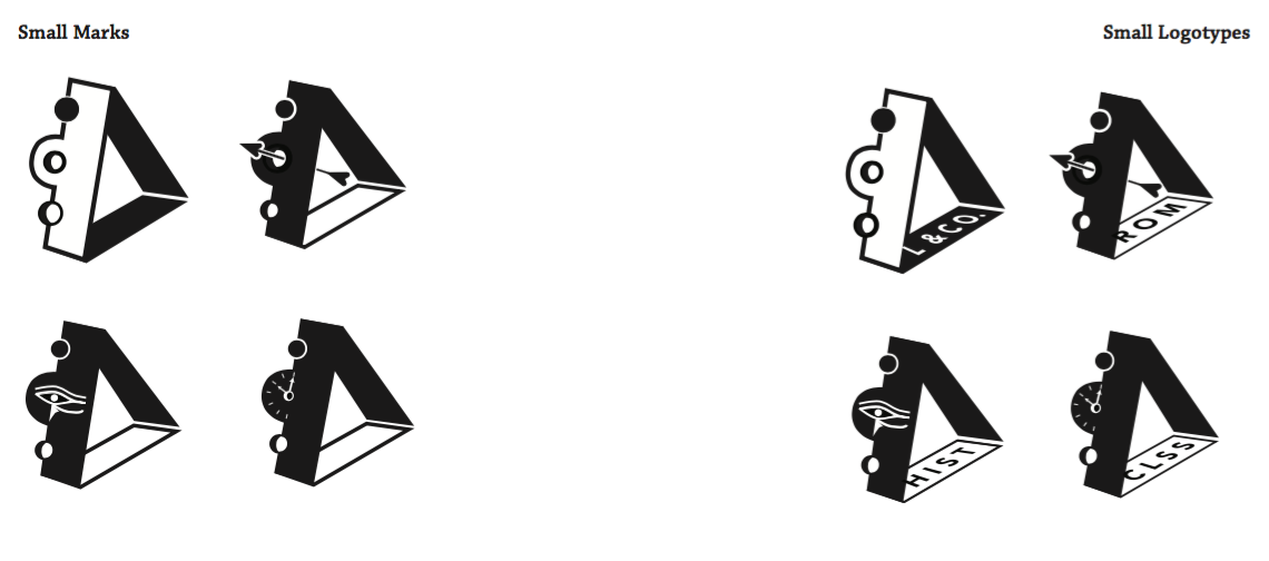
We were given three random words and a fake publisher name to create a unique publisher's mark. My assigned words were: Elegant, Architectural, and not Classic, and my company name was called Litotes & Company. We also had to create a system of logos used for different book genres (mine being romance, history, and classics).
The final result is a clean and refined logo using negative and positive space to create the image of contradiction (litotes being defined as "an ironic understatement in which an affirmative is expressed by the negative of its contrary", ex: "You won't be sorry" meaning "You will be glad").
In the romance genre, I used an arrow (like Cupid's arrow). In the history genre, I rendered the eye of Horus, an famous ancient Egyptian symbol, and lastly for classics, I used a small clock-face to emphasize the familiarity of a classic novel.