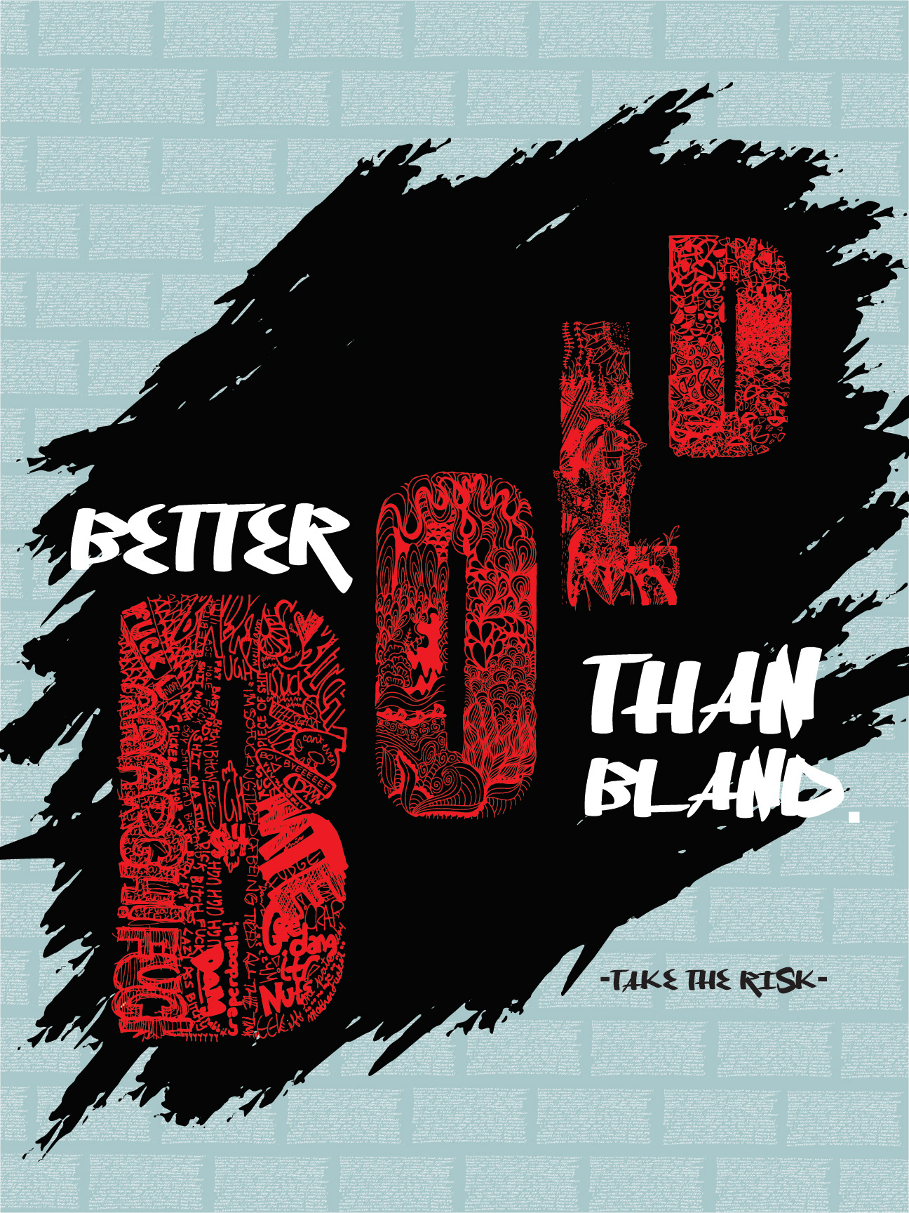
For this last assignment, we were tasked to give advice to the next graphic design first year students using handmade letterforms. We would each receive a letter and create a prompt for 9 other people to decorate that letter with. For example, I received the letter "B" and the prompt was to put as many exclamations, sounds, curse words, or phrases they could think of into it. The "B" I used in this poster was the final result. I wanted my poster concept to reflect the letters that I used, especially the "B", so I decided to go with the phrase "Better Bold Than Bland: Take the Risk", because the prompt I chose for my letter was a risky concept in the first place.
I am also incredibly influenced by graffiti art and the boldness of the art style, so I wanted the poster's aesthetic to mirror graffiti artwork found on the streets. The "bricks" of the graffiti wall in the poster are a repetition of a handwritten paragraph I wrote detailing my personal advice to the first year students, but small enough that it isn't noticeable from afar, which is a small hidden element that I enjoy to do in my pieces. I've found that throughout my graphic design learning experience, doing something out there is much more rewarding than doing something safe.